Data Examples
Exploring Navigation Examples
Northern Water's data portal provides multiple options for locating and viewing time series and water quality data.
Note that clicking on all images opens them in full view.
Timeseries Data From the Map View
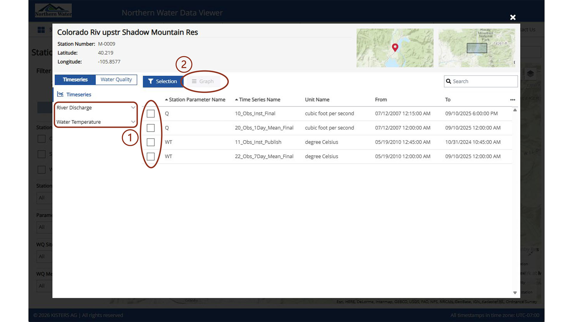
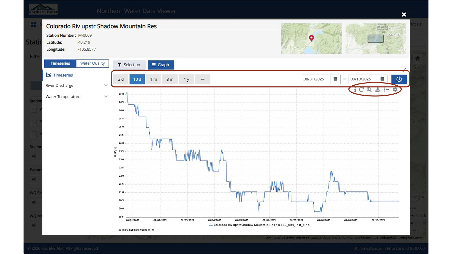
Once a station icon is selected in the map view, a Station Overview window opens. In this window, select the parameter on the left (1) where drop down of timeseries by constituent is available, or view all options in the main window area. When a parameter is selected, the (2) Graph button becomes active.
To locate data, use the filter panel on the left side of the page. These filters help narrow the list of stations to those that meet specific criteria. Within the Map, there is +/- arrow in the upper left corner. At broader zoom levels, some station names may not appear; zooming in will reveal additional labels. In the upper right corner of the there is a Zoom/Pan, A Select by Rectangle, Select by Polygon, and a Legend that gives overlay and base layer options. There is a legend that can be expanded in the bottom right corner that includes the symbols used in the station type filter panel. Note how many stations are both Surface water and Water quality station and are identified as Combined stations.
Water Quality Data from the Map View
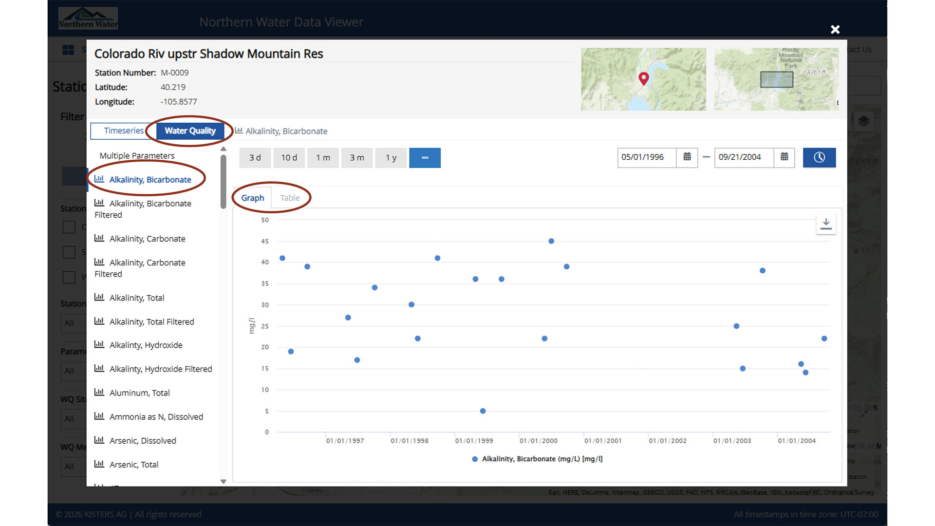
Once the Station Overview window is opened, select the Water Quality tab located next to the Timeseries tab. Single selection in the left panel is available to populate the main window with the dataset for the selected time period. Data may be viewed as either a graph or a table, depending on the active view. In graph view, hovering over a data point reveals associated metadata.
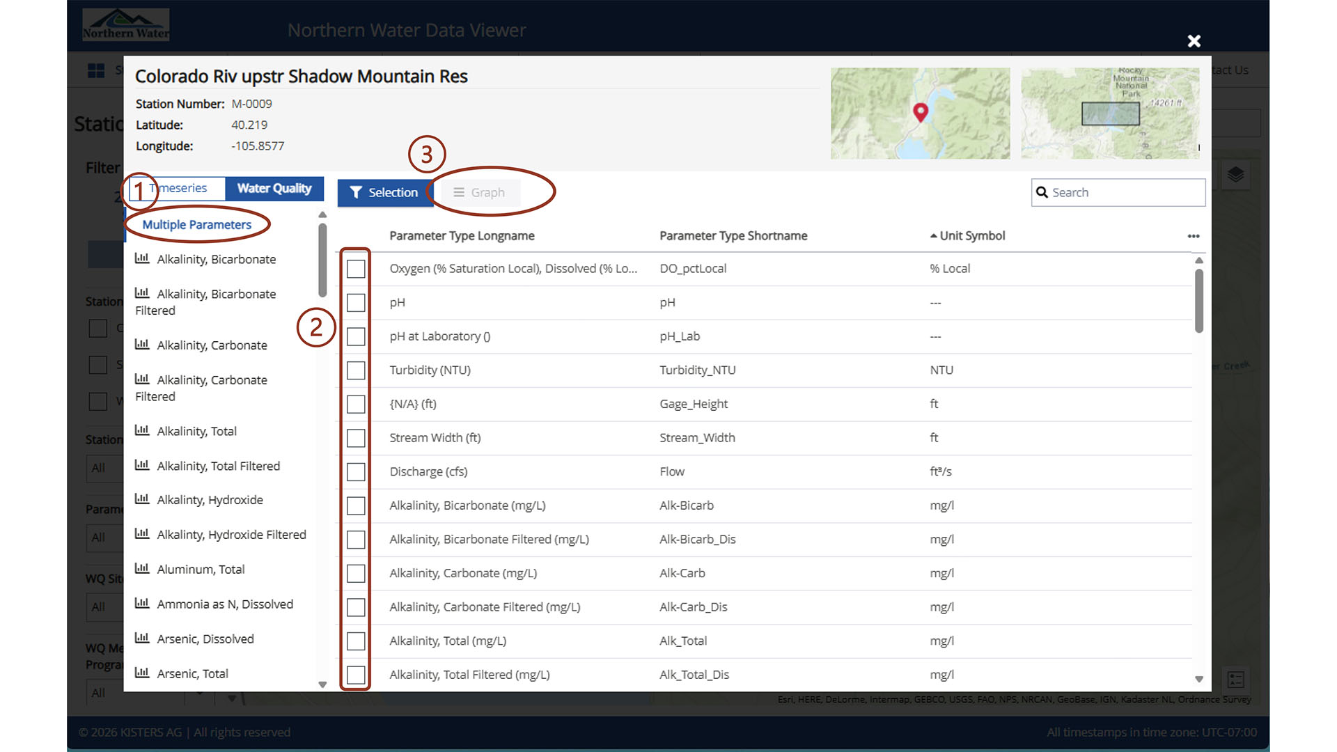
Another functionality is the multiple parameter selection. Here, you must select the stations to view in the main window, and only then will the graph view become available.
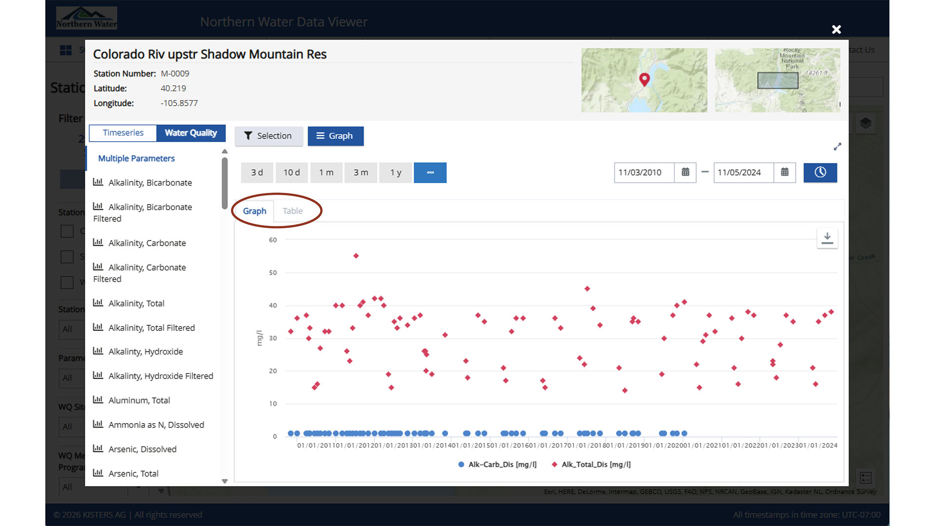
Once Graph is selected, the interactivity is similar to the timeseries data, but there is also the capability to toggle between graph and table from this view.
Timeseries and Water Quality Data from the Map View Using Select by Polygon
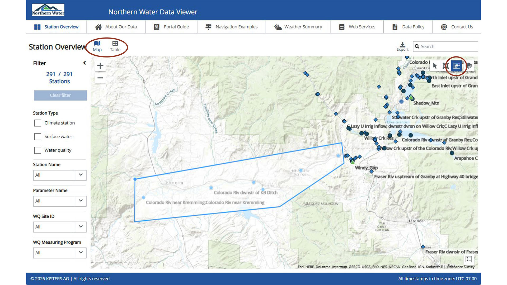
The Select by Rectangle and Select by Polygon use coordinates to filter stations of interest. This is an example where Select by Polygon is being used. Click on the Select by Polygon icon and click on the map to combine points results in a polygon and defines the boundaries for an area of interest. Once a polygon is built, select table in the upper right corner next to the Station Overview title.
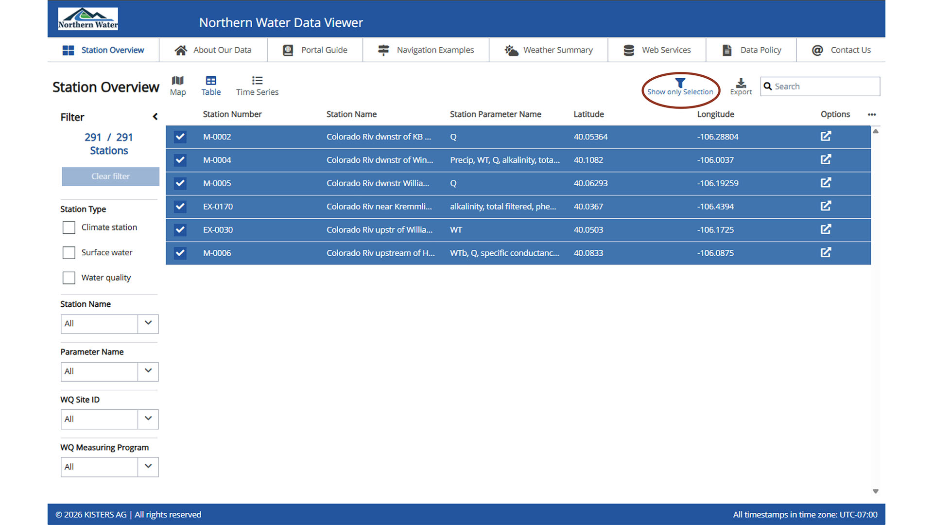
All available stations will show until the Show only Selection button is selected. Then only stations in the polygon will be displayed. From here, all station metadata is available and can be exported and referenced. View individual stations in table or graph view by unchecking the other stations.
Timeseries Data from the Table View
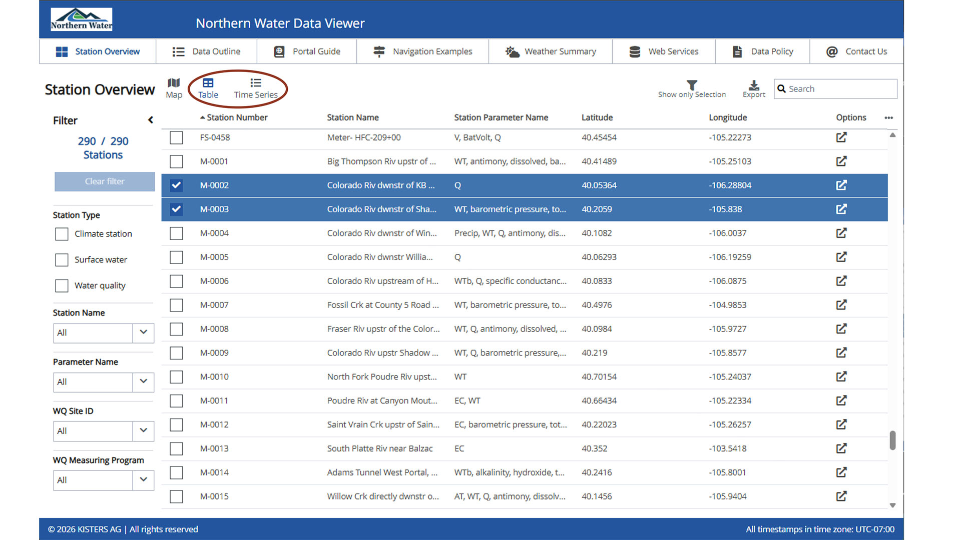
As with the map view, the filter panel on the left can be used to narrow the list of stations. Column headers in the table may also be used to sort results; an arrow icon indicates the active sort direction. Unlike the map view, the table view allows multiple time series to be graphed simultaneously. Select the checkboxes for the desired stations. When at least one station is selected, the Time Series option becomes available.
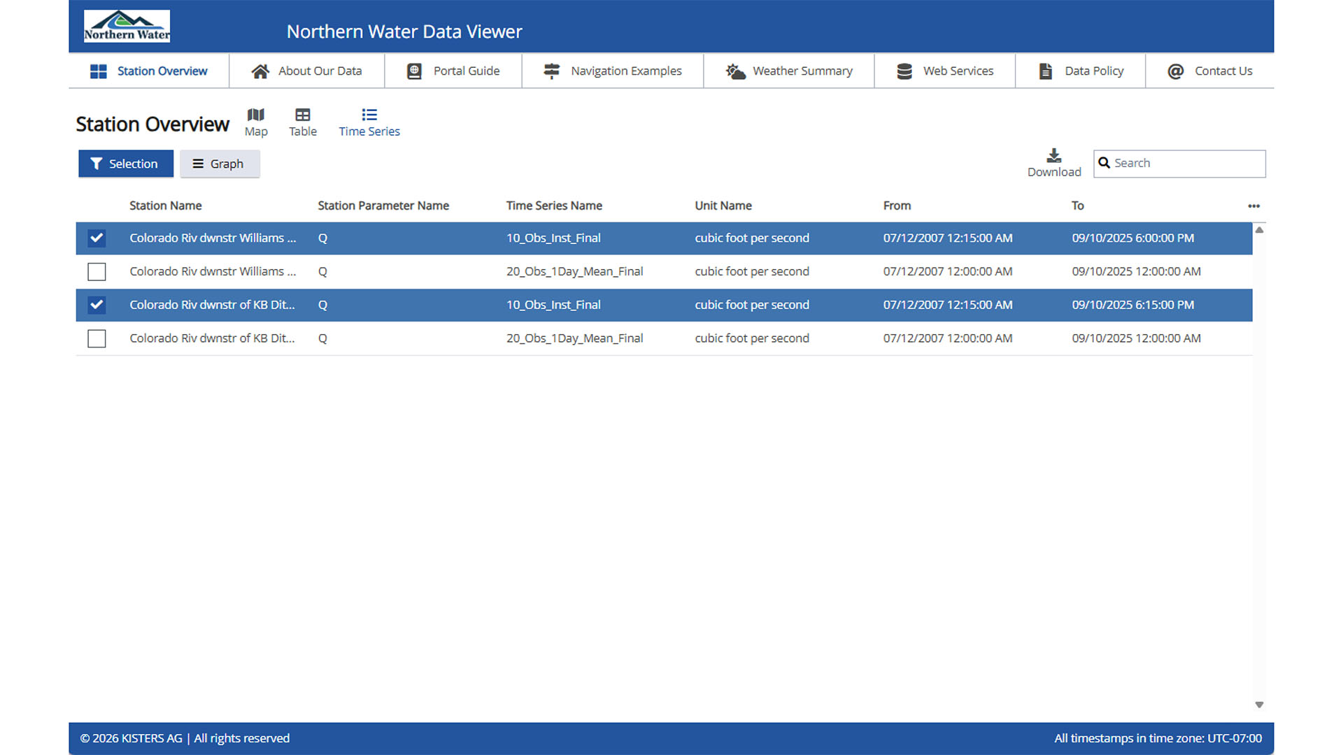
Selecting Time Series opens a new page displaying all available graphs. When one or more stations are selected, the Graph button becomes active.
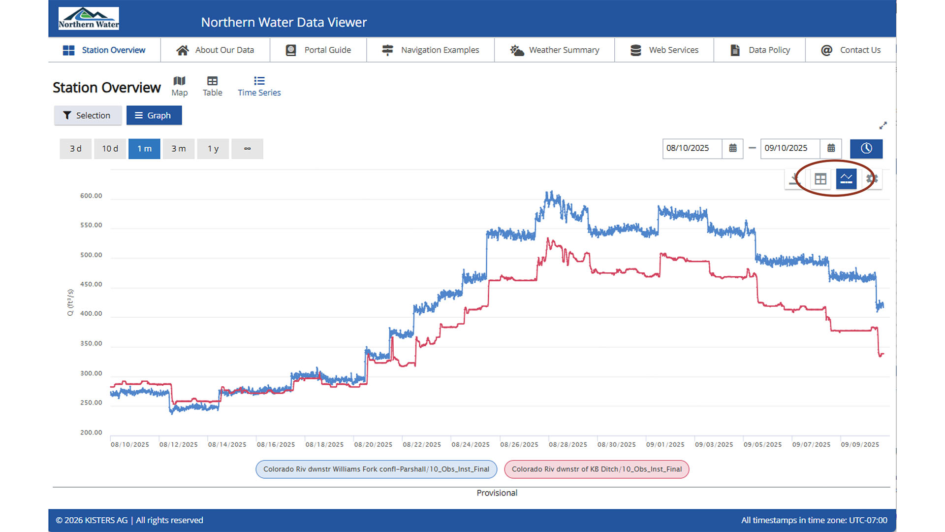
After selecting Graph, the resulting page displays the combined graph. As in the map view, the time period may be adjusted. A unique feature of this view is the ability to display both the data table and data quality indicators alongside the graph.
Water Quality Discrete Data from the Table View
To view water quality data from the table view, double click the row of the station of interest. Do not click the checkbox used for selecting stations for time series graphs. Double clicking opens the same Station Overview window used in the map view. From there, water quality data may be accessed using the steps described in Water Quality Data from the Map View.